Cognitive Scale
Cognitive Scale eBook
Creator of quality designs and thinker of fresh ideas.
This project that I have worked on was previously designed by a different designer, my instructions were to update it but not to make it look different from the previous version, but to have it deliver the same feeling.
Cognitive Scale eBook
Creator of elegant and powerful info pages
Light informational pages are as powerful as any other page with heavy text and imagery in it, it doesn't take much to deliver the message with the right image linked to the text

Page Comparison
Use the red divider below to slide left or right for page comparison, or click on one of the tabs to see more examples.
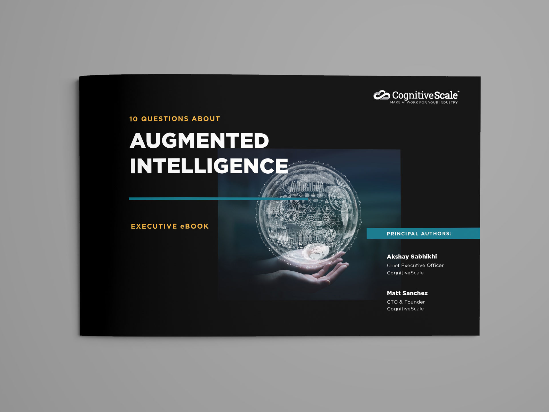

On the left side you can see the previous version and have a better idea of how everything is out of order and not aligned very well.
On the right side you can see my version of the first page, I wanted to make the design look as simple as possible, all the info perfectly aligned.


Again on the left side you can see the opened eBook showing two pages and how they looked before they got redesigned, although the right page was somewhat ok, I was not a fan of the left page at all.
On the right side you can see my versions of design. The left page giving the feeling of connection between human and AI, also, the right page being everything aligned to the touch to make reading easier.


On the left side I didn’t like how the quote took all the space covering the black and white yet colored image! What?!
On the right side everything has been moved to fill the dead spaces in the all colorful image, which were also linked together as the person is pointing to the quote. Though I’m not sure if they liked the quote or not!
Check out the electronic documents below
Quali
Quali Digital Brochure
Design a digital brochure for Quali that has the same feeling throughout the document. Managed to design a new form for them but also kept their brand identity. Having the three major colors be seen on every page of the document.

Layout design
Everything about the document is simple and elegant. It’s easy to read and navigate through.

Consistent Format
Consistent format that enables for a very easy understanding of information placement; knowing when a topic ends and the new one begins.

New Bulletpoints
Designed new bulletpoints and added them in the document which gives the page a very beautiful and light design.