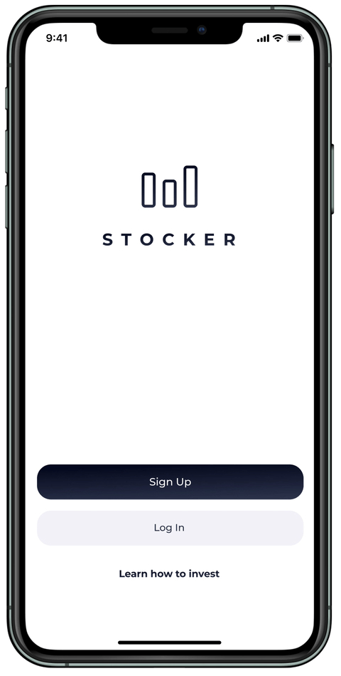
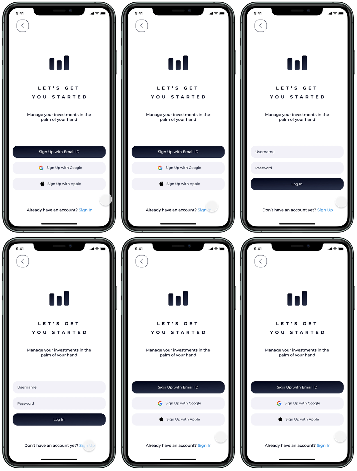
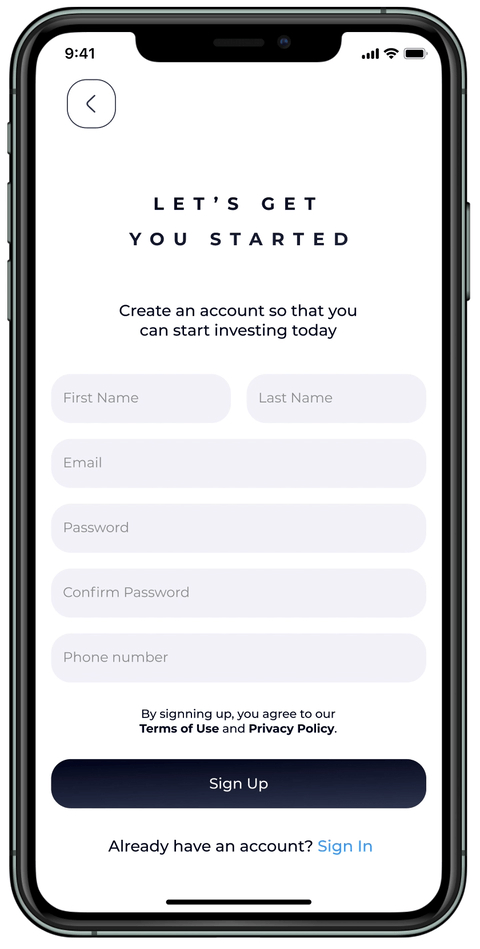
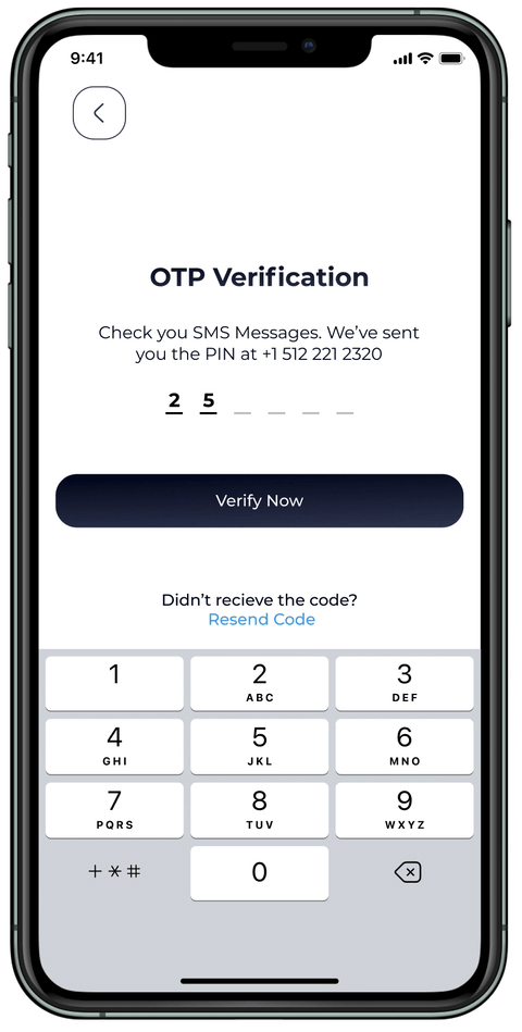
Stocker is a product of my personal vision. It enables investors to consolidate all their existing accounts in a single platform, facilitating seamless transfer of shares between these accounts. Additionally, it incorporates a feature that permits users to engage in virtual investment simulations (similar to a game) in real-time, while simultaneously monitoring their return investments.


Stocker
UX Stages
- Discovery
- Research
- Data Analysis
- Design
- Testing
Discovery
The application design simplifies investor challenges and streamlines platform operations. Stocker also serves as a learning platform, enabling investors to validate stock market predictions. It eliminates the time-consuming process of calculating investment standings and potential returns, enhancing the learning experience.
Investors gain access to a centralized platform integrating all their accounts, providing a comprehensive view of their investments. Previously, transferring between trading accounts involved selling shares and relocating assets, which was time-consuming. This platform introduces the convenience of transferring shares within the application, reducing time and effort, encouraging investors to allocate more funds to their current accounts.

Research
To ascertain investor support for a platform that facilitates the seamless integration of all accounts, I conducted research to identify their pain points during share migrations and the associated steps. Additionally, I explored the potential support from influencers for an application dedicated solely to merchandise sales.
To enhance my understanding of the research findings, I developed user personas representing diverse investor segments. By identifying the pain points and behaviors of this audience, I aimed to design a digital application that effectively addresses their specific needs.
The research process involved two in-depth interviews and surveys conducted with 12 investors who collectively hold over $50,000 in investments across multiple accounts.
What platform do you currently use to invest? [Participants may be using more than one platform]
How was the trading experience? [Positive or negative?]
What was the outcome? [Did you meet your return goals?]
shares because they are cheaper, or do they research the stock market?]
Data Analysis
User Interviews
User Surveys
Prototype Testing
Persona
User Journeys
Information Architecture
Data Analysis
I was not surprised to find that investors were enthusiastic about the idea of a platform dedicated to allowing cross-platform synchronization for their investments. I found out that the new comers are motivated to use a simple platform, where they would have imaginary money to invest and be able to analyze their positions.
Persona
Philip Martinez, 29
Texas, USA - Investor - $30,000
Philip is an enthusiastic person who loves what he does. He is a Marketing Manager and also follows the stock market. Philip loves technology, art, and traveling. Most of his motivation comes through researching the market. Philip loves his hobby and follows over 100 pages online regarding investments and trading. Philip makes a living from trading on the side using third party websites.
User Flows

Design
Sketching: As I conceptualized and conceptualized the platform’s structure, I prioritized ensuring its practicality and user-friendliness. To facilitate this, I engaged in a series of sketching exercises. These exercises encompassed various techniques, including “crazy 8s,” detailed sketching, and rough sketching.
Wireframing: The subsequent phase involved the creation of wireframes for several primary screens. Subsequently, I utilized Figma to evaluate the user flows that had been conceptualized earlier in the process.
Mockups: Upon successfully validating the wireframes, I embarked on the process of designing high-fidelity mockups of the application. Throughout this endeavor, I iteratively refined my designs to attain optimal outcomes.
Prototyping: Utilizing Figma, I designed a high-fidelity, clickable prototype that exemplified the platform’s salient features.

Testing
For usability testing, I utilized Lookback.io and in-person observation. Through Lookback.io, I observed the time it took users to locate the “Demo Mode” page of their account. Users were able to find the “Demo Mode” page within a few seconds of navigating the app. From in-person observation, I assessed the overall flow and usability of the app. I discovered that users appreciated the ease of switching between pages using the navigation tabs located at the bottom of the screen. This feature facilitated a seamless transition between pages.

Style Guide
#030721
#323B56
#FFFFFF
#FF564F
#35DB6F
#F4F4F9
Montserrat Bold
Aa
A B C D E F G H I J K L M N O P Q R S T U V W X Y Z
a b c d e f g h i j k l m n o p q r s t u v w x y z
Montserrat Regular
Aa
A B C D E F G H I J K L M N O P Q R S T U V W X Y Z
a b c d e f g h i j k l m n o p q r s t u v w x y z
Noto Sans Regular
Aa
A B C D E F G H I J K L M N O P Q R S T U V W X Y Z
a b c d e f g h i j k l m n o p q r s t u v w x y z
