During my tenure at PECB, I was involved in various design projects, including the quarterly publication of magazines. These magazines effectively showcased our company’s work during each quarter and served as a promotional tool for upcoming courses and events organized by our organization. Each magazine was meticulously designed from scratch, encompassing all its elements, such as infographics, icons, advertisements, and image modifications.
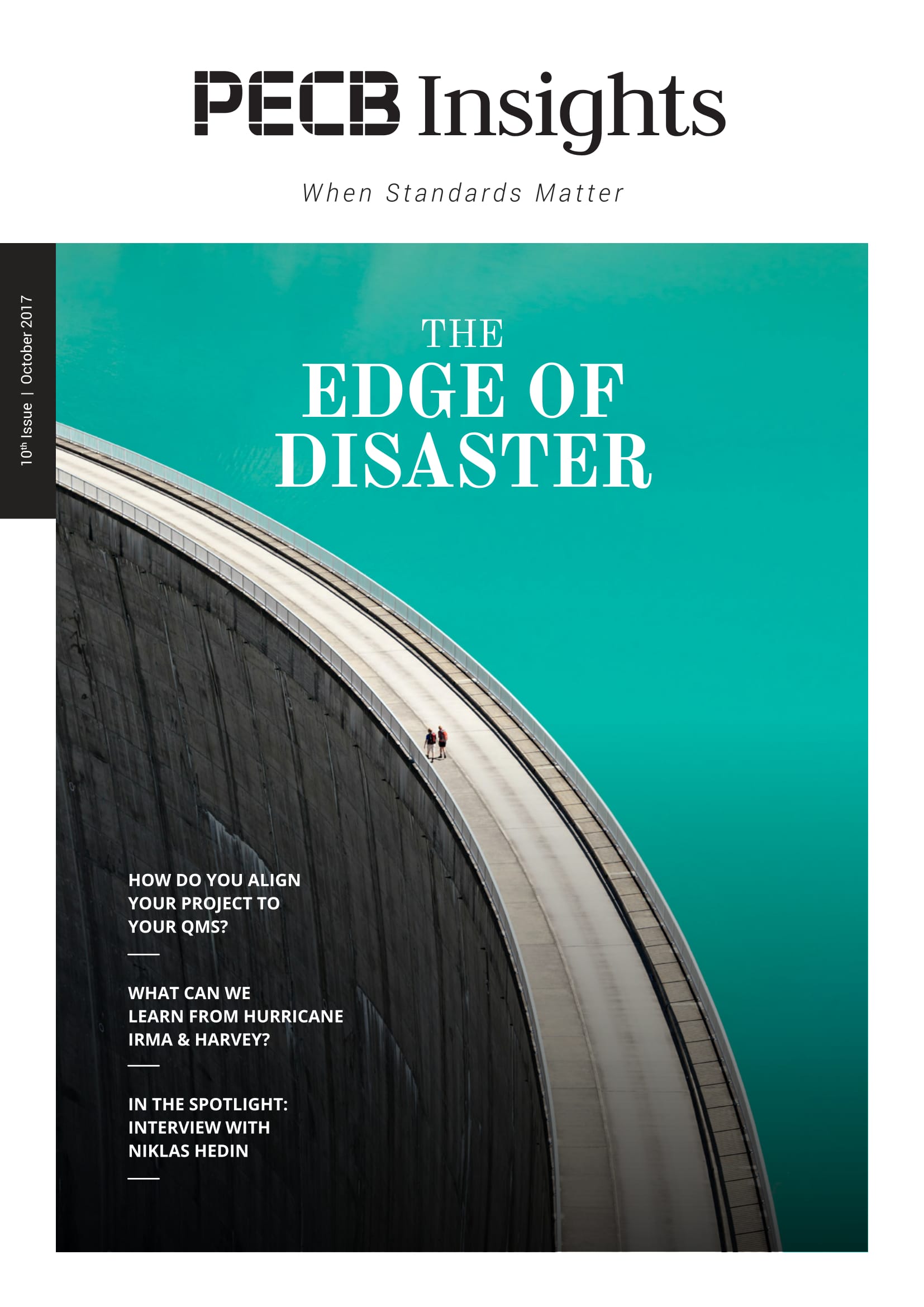
Magazine

Simplicity
A simple design that goes through pages.
Seriousness
The sharp edges show that even in a simple design the information is serious.
Easy reading
The text is made to make it easier for the reader to go through the information with the addition of extra design added to the quote.
Consistency
A consistent design throughout the magazine.
Layout
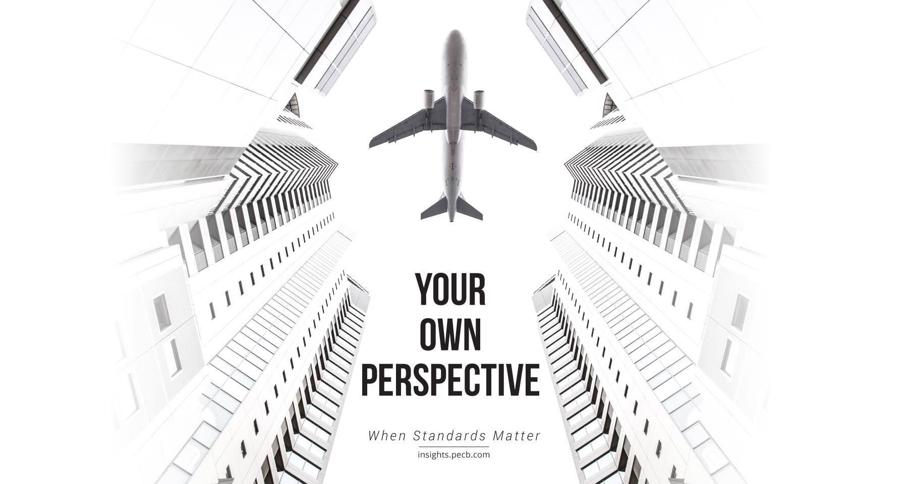
In this page, we sought to capture readers’ attention by prominently displaying all the newly introduced and updated courses. The visual representation of the road signifies that there are numerous opportunities within the company for individuals to achieve greater success.

Typography
Roboto Bold
A B C D E F G H I J K L M N O P Q R S T U V W X Y Z
a b c d e f g h i j k l m n o p q r s t u v w x y z
Roboto Regular
A B C D E F G H I J K L M N O P Q R S T U V W X Y Z
a b c d e f g h i j k l m n o p q r s t u v w x y z
Roboto Light
A B C D E F G H I J K L M N O P Q R S T U V W X Y Z
a b c d e f g h i j k l m n o p q r s t u v w x y z
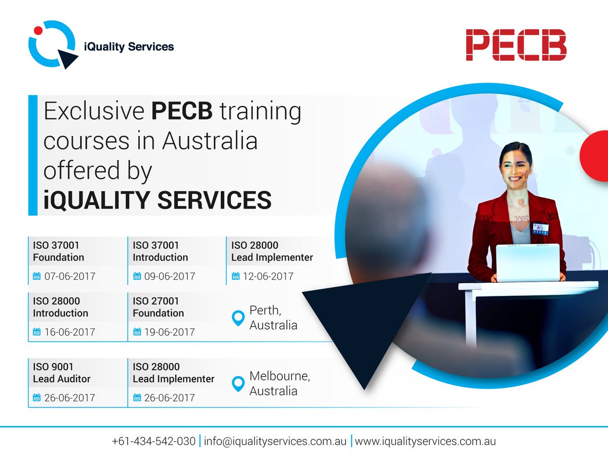
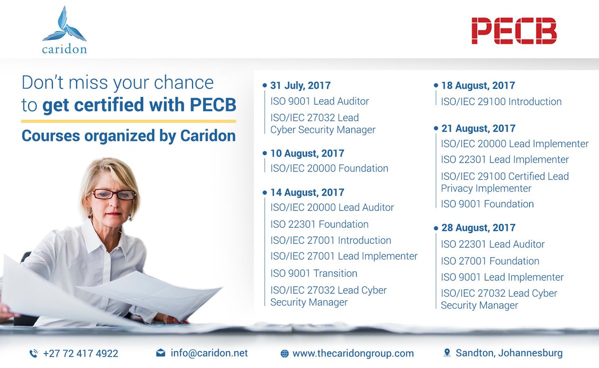
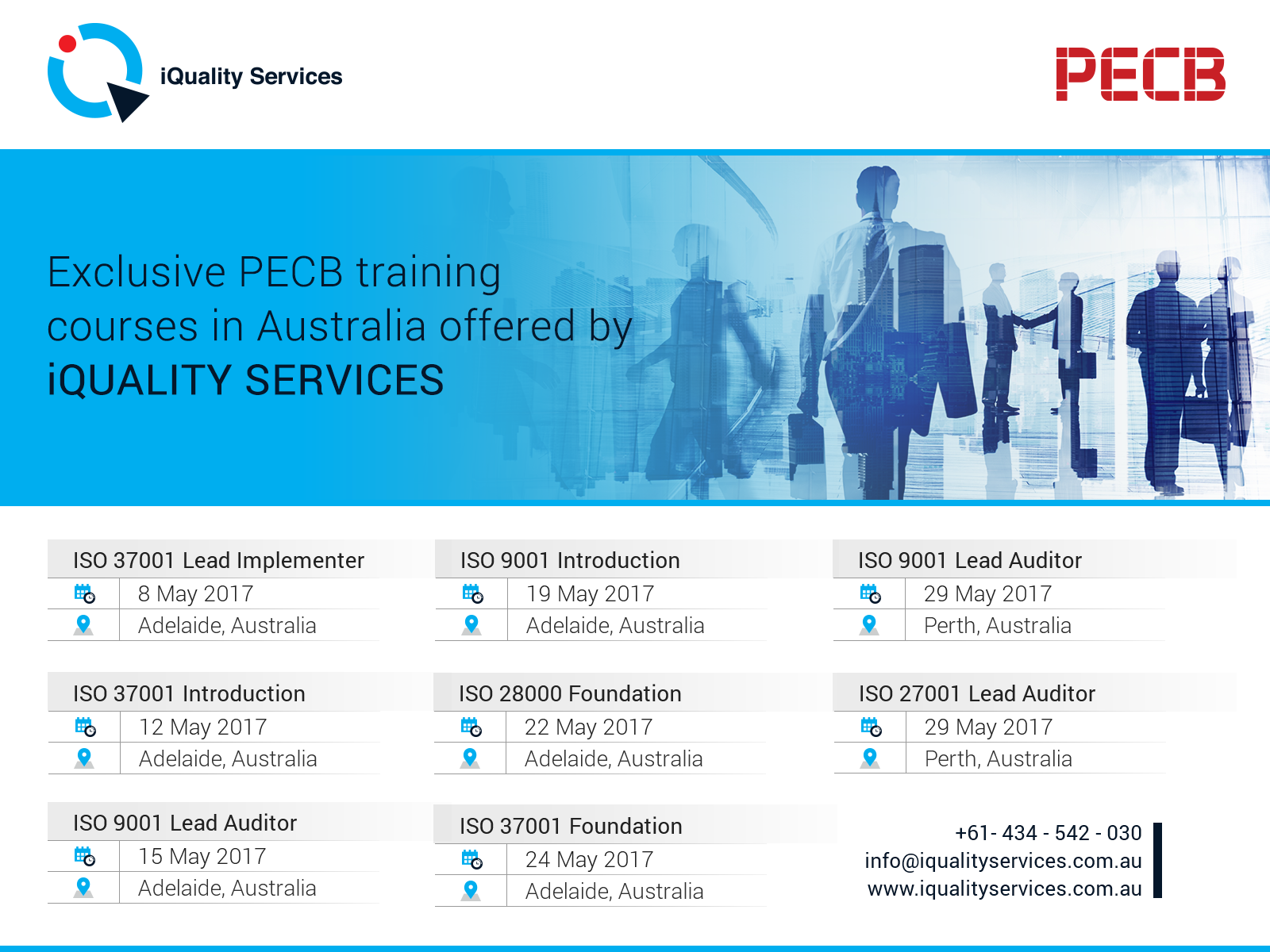
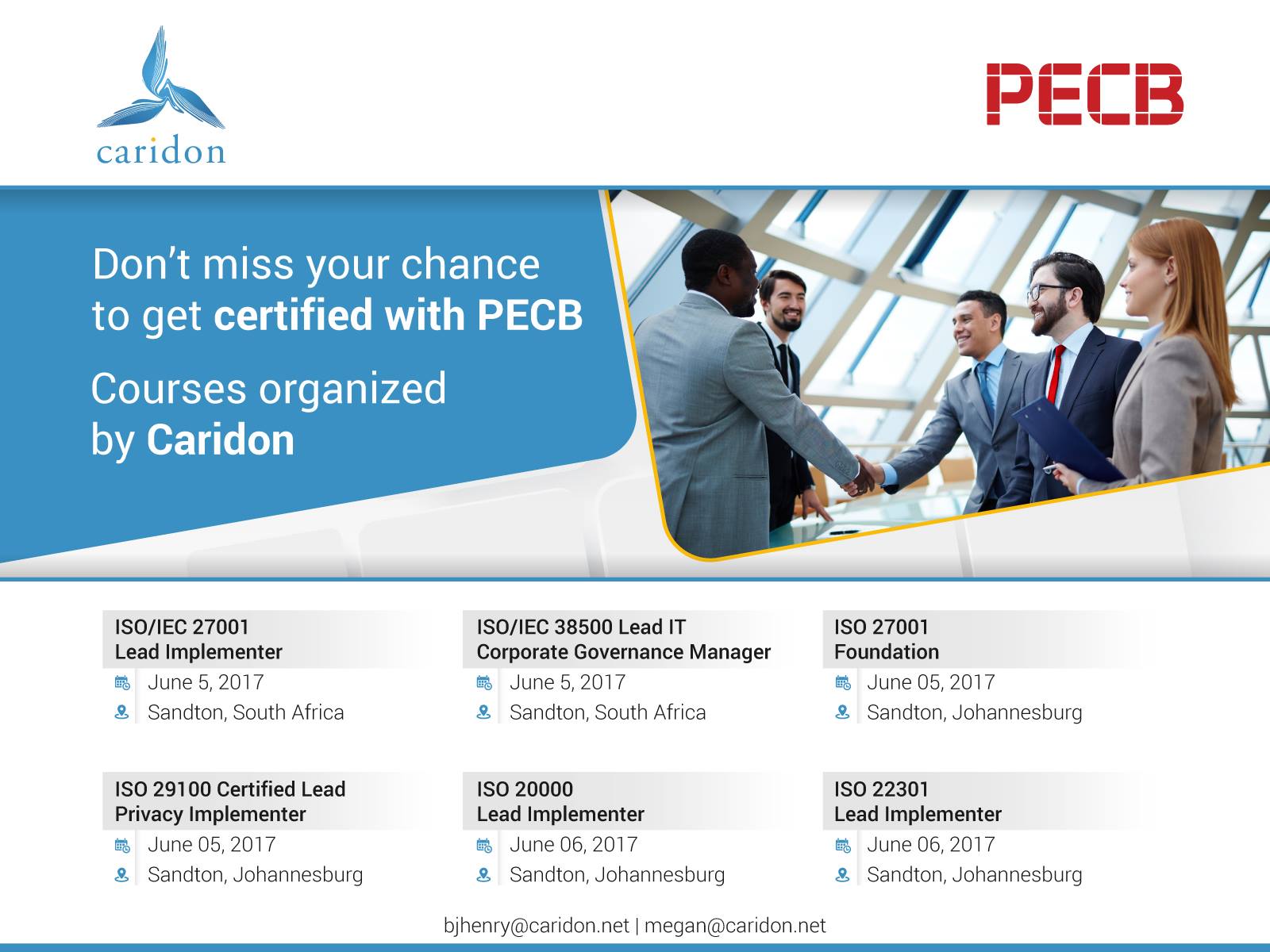
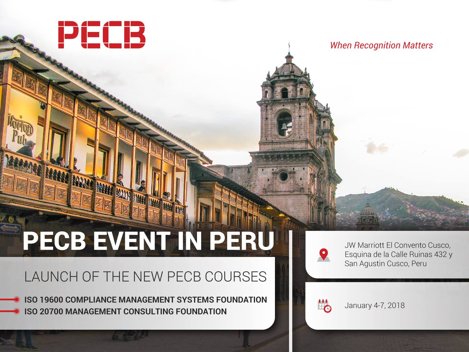
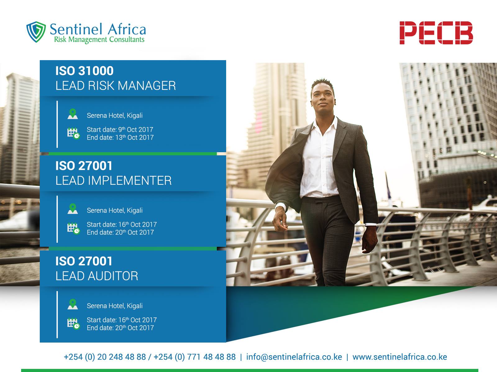
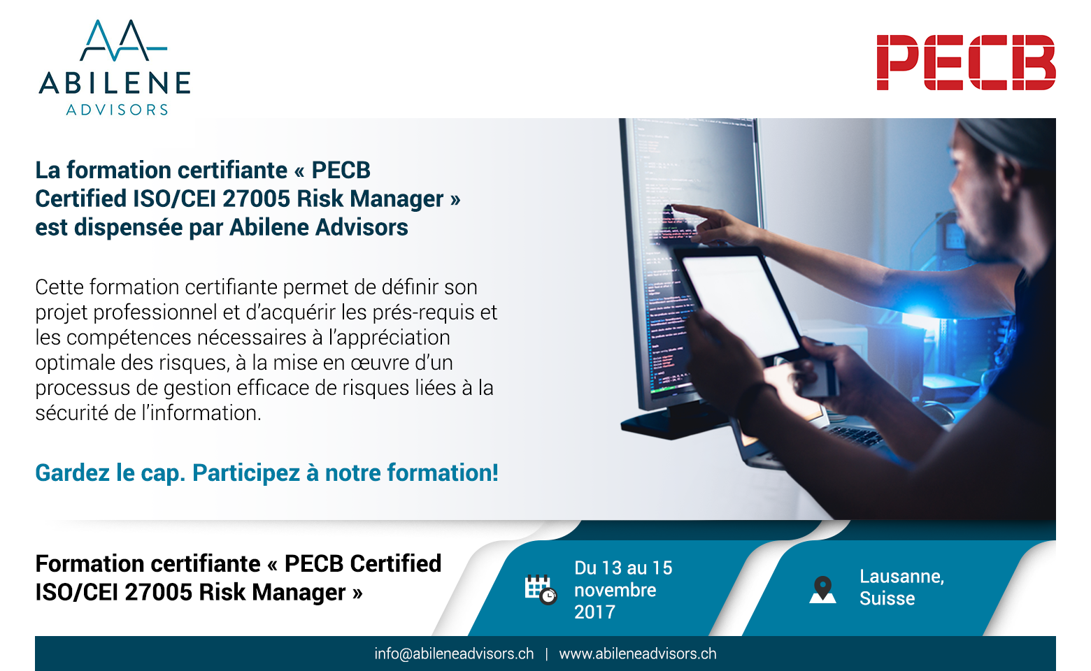
Flyers


Visual
Attractive flyers designed to appeal to the partners’ preferences while effectively conveying the information.
Colorful
Each flyer is meticulously crafted, selecting colors that harmoniously align with the brand’s established color palette.


